Why Does Agreeable Gray Look Purple? (The Undertone Fix Decorators Use)

In this article
- Why Agreeable Gray Looks Purple: The Hidden SW 7029 Undertone
- 4 Things That Turn Agreeable Gray Lavender Overnight
- Try the $12 Bulb Fix Before Buying New Paint
- Agreeable Gray vs. 3 Warmer Paint Swaps (Tested by Exposure)
- How to Test Paint Swatches So You Never Miss an Undertone
- Trim Colors That Stop Agreeable Gray From Turning Purple
- How Sofas, Floors, and Hardware Shift Wall Undertones
- Pre-Paint Fix Budget: $28 Test vs. $140 Repaint Mistake
- Agreeable Gray Paint & Undertone FAQs
- Does Agreeable Gray look purple in a bedroom with carpet?
- What trim color stops Agreeable Gray from looking lavender?
- Is Accessible Beige better than Agreeable Gray for dark hallways?
- Can painting the ceiling help balance purple greige tones?
- How much paint does a standard 12×12 living room take for 2 coats?
You stood in the Sherwin-Williams aisle looking at a crisp paper chip, picked the safest bestselling greige in America, spent $120 on two gallons and a roller kit, and by 4:00 p.m. your living room corners turned dusty lilac. Knowing why Agreeable Gray looks purple saves you from repainting the wrong shade twice — because the culprit is almost never defective tint. It is basic color temperature colliding with hidden undertone physics.
Why Agreeable Gray Looks Purple: The Hidden SW 7029 Undertone
Most homeowners assume gray paint is just black mixed into white. True neutral gray rarely sells well for walls because it feels icy and institutional, so paint chemists warm greige paints up using subtle yellow, green, or red-taupe tint formulas.
Agreeable Gray (LRV 60) sits right in the middle — light enough to brighten a small apartment, warm enough to coordinate with oak floors. However, its warmth leans slightly toward taupe-violet rather than crisp olive-beige. In sunny south or west exposure, golden afternoon sunlight brings out its cozy beige side. Take away warm direct light, and blue sky reflection suppresses yellow tones while amplifying violet-blue undertones across shaded drywall.
4 Things That Turn Agreeable Gray Lavender Overnight
- North-facing or tree-shaded windows: Northern daylight carries a cool blue cast all day long, dragging greiges toward silver-lavender.
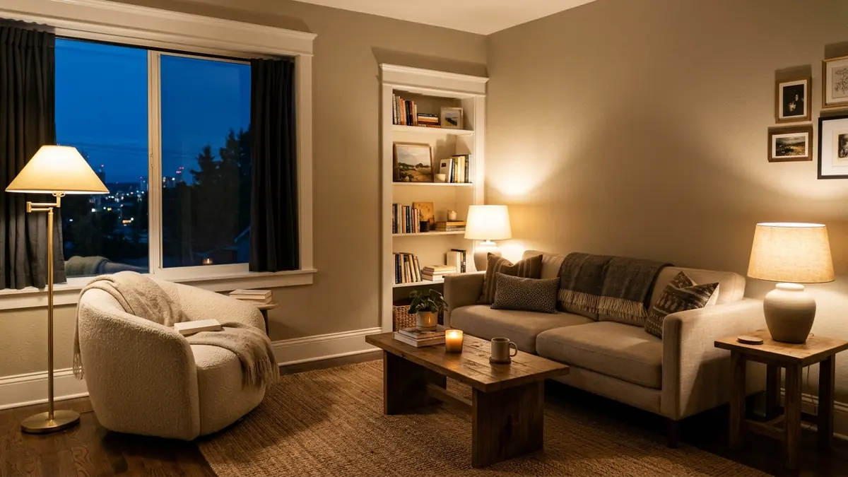
- 4000K–5000K “Daylight” LED bulbs: Hardware store multi-packs labeled “Bright White” or “Daylight” emit heavy blue wavelengths that push Agreeable Gray straight into lilac after sunset.
- Stark cool-white ceiling trim (e.g., Extra White SW 7006): Putting a blue-undertone white next to greige creates a contrast illusion that exaggerates any trace of pink or violet on the wall.
- Pink-beige carpets or cherry wood floors: Flooring pulls wall color reflection upward — reddish oak or peach builder carpet intensifies taupe-purple shadows in tight bedrooms.
Try the Bulb Fix Before Buying New Paint
Before spending another weekend taping baseboards, test the cheapest fix in decorating: replace every overhead and lamp bulb in the room with ENERGY STAR-rated 2700K Warm White LEDs (90+ CRI) ($10–$16 for a 4-pack). Higher CRI (Color Rendering Index) bulbs restore full warm red and amber light waves that cheap 80 CRI bulbs skip, pushing Agreeable Gray back toward clean oatmeal greige in five minutes.
Pair bulb changes with one soft cream or warm white lamp shade — and if your woodwork is stark icy blue-white, even swapping a cool overhead flush mount using a linen drum shade softens wall shadows dramatically.

Agreeable Gray vs. 3 Warmer Paint Swaps (Tested by Exposure)
If your room gets almost zero direct sunlight — such as an interior hallway, dark north bedroom, or lower-level living room — fighting violet undertones with lighting alone may still bother you by morning daylight. Compare these three proven US paint alternatives before rolling coat one:
| Paint Color & Code | LRV (Light Reflectance) | Core Undertone | North-Light Verdict |
|---|---|---|---|
| SW Agreeable Gray (SW 7029) | 60 | Warm taupe-gray (faint violet shift) | Risky in dim north rooms; best in warm south/west light |
| SW Accessible Beige (SW 7036) | 58 | Green-yellow khaki beige | Stays earthy warm greige — green cancels purple reflection |
| BM Pale Oak (OC-20) | 69 | Airy soft warm greige | Brighter than Agreeable Gray; minimal gray muddiness |
| SW Shoji White (SW 7042) | 74 | Warm off-white putty | Zero purple cast; ideal for dark, low-ceiling small apartments |
How to Test Paint Swatches So You Never Miss an Undertone
Never paint wet sample squares directly onto an already-painted yellow or peach wall — the old wall color fools your eye instantly. Instead, roll two coats onto white poster boards or order peel-and-stick vinyl swatches ($6–$9 each), leave a crisp two-inch white paper border around every sample, and move those boards across three walls: the bright window wall, the shaded corner beside the trim, and the darkest wall opposite the window at 9:00 a.m., 2:00 p.m., and 8:00 p.m. under lamplight.
Trim Colors That Stop Agreeable Gray From Turning Purple
When you keep Agreeable Gray, avoid crisp blue-whites on trim and doors. Pair SW 7029 with Sherwin-Williams Pure White (SW 7005) or Alabaster (SW 7008) in satin or semi-gloss trim — their slight warmth harmonizes with greige instead of highlighting purple shadows. For walls themselves, choose an eggshell or matte finish; glossy wall sheen bounces cool window glare straight across rooms and intensifies color shift.
How Sofas, Floors, and Hardware Shift Wall Undertones
Walls never sit in a vacuum. When Agreeable Gray looks dusty purple in one living room and warm oatmeal in another, furniture reflection is often the silent multiplier. Cool charcoal sofas, chrome floor lamps, and gray synthetic rugs echo blue waves right back onto shaded drywall corners, locking in that purple cast. By contrast, warm natural textures act as an optical counterweight:
- Wood tones: Honey oak, light ash, and mid-tone walnut add amber warmth around eye level, calming cool north shadows without painting a single extra wall.
- Hardware and lamps: Unlacquered brass, antique bronze, and linen or woven paper lampshades cast golden bounce across wall surfaces at night.
- Textiles and rugs: Natural jute, cream wool bouclé, oatmeal linen curtains, and terracotta or cognac cushions pull the taupe pigment back toward cozy beige.
Pre-Paint Fix Budget: Test vs. 0 Repaint Mistake
Before opening another custom-tinted paint can, run a low-cost diagnostic weekend check across lighting and samples:
| Diagnostic Step | Item Needed | US Retail Cost | What It Solves |
|---|---|---|---|
| Step 1: Correct evening glare | 4-pack 2700K LED bulbs (90+ CRI, 800 lm) | $12–$16 | Stops cool blue LEDs from flipping walls lilac after dusk |
| Step 2: True daylight comparison | 2 peel-and-stick warm paint samples (SW 7036, OC-20) | $12–$14 | Tests green-beige vs. warm greige across all 4 walls risk-free |
| Step 3: Full room repaint (if needed) | 1–2 gallons eggshell interior paint + roller kit | $110–$160 | Only needed if north daylight remains too blue for SW 7029 |
Ready to calculate exact gallons and quarts for your living room or accent wall before ordering a repaint? Plug your wall dimensions and doors into our free Paint Calculator first so you never overbuy an extra $65 gallon.
Agreeable Gray Paint & Undertone FAQs
Does Agreeable Gray look purple in a bedroom with carpet?
Often yes — especially over beige builder carpets that carry pink or peach undertones. Overhead bounce from beige carpeting reflects warm-pink light onto shaded walls, creating a noticeable mauve-gray tint unless offset by warm 2700K bedside lamps and green foliage or cream linen curtains.
What trim color stops Agreeable Gray from looking lavender?
Pure White (SW 7005) offers the cleanest neutral white balance without strong yellow or icy blue cast. Avoid Extra White (SW 7006) or Chantilly Lace if north windows make your walls lean cool.
Is Accessible Beige better than Agreeable Gray for dark hallways?
Yes, in windowless corridors or shaded north foyers, Accessible Beige (SW 7036) holds its warm beige backbone much better because its slight green-khaki undertone neutralizes violet shift. Just keep 2700K lighting overhead so it stays cozy instead of muddy.
Can painting the ceiling help balance purple greige tones?
Painting a stark builder-grade blue-tinted ceiling with flat Pure White or matching 50%-cut wall paint lowers harsh contrast along the ceiling line and stops top shadows from pooling purple in low-ceilinged rooms.
How much paint does a standard 12×12 living room take for 2 coats?
Roughly one to two gallons depending on window openings and whether you are covering an already-neutral flat base. Always check exact square footage deductions with our Paint Calculator before mixing custom tint cans.
Related: Building a warmer small-space palette around soft neutrals? Explore our Japandi interior design rules, quiet luxury bedroom ideas, and dark cozy living room lighting tricks.

Evelyn Marlowe is a home decor writer and small-space devotee covering budget-friendly decorating, rental-friendly upgrades, and seasonal styling — always with real prices and practical advice. Her rule: beautiful homes should be livable, not just photographable.
Related Stories

What Is Traditional Interior Design? Timeless Decor Rules, Elements & Ideas
How to Mix Patterns in Home Decor: 3-Pattern Formula